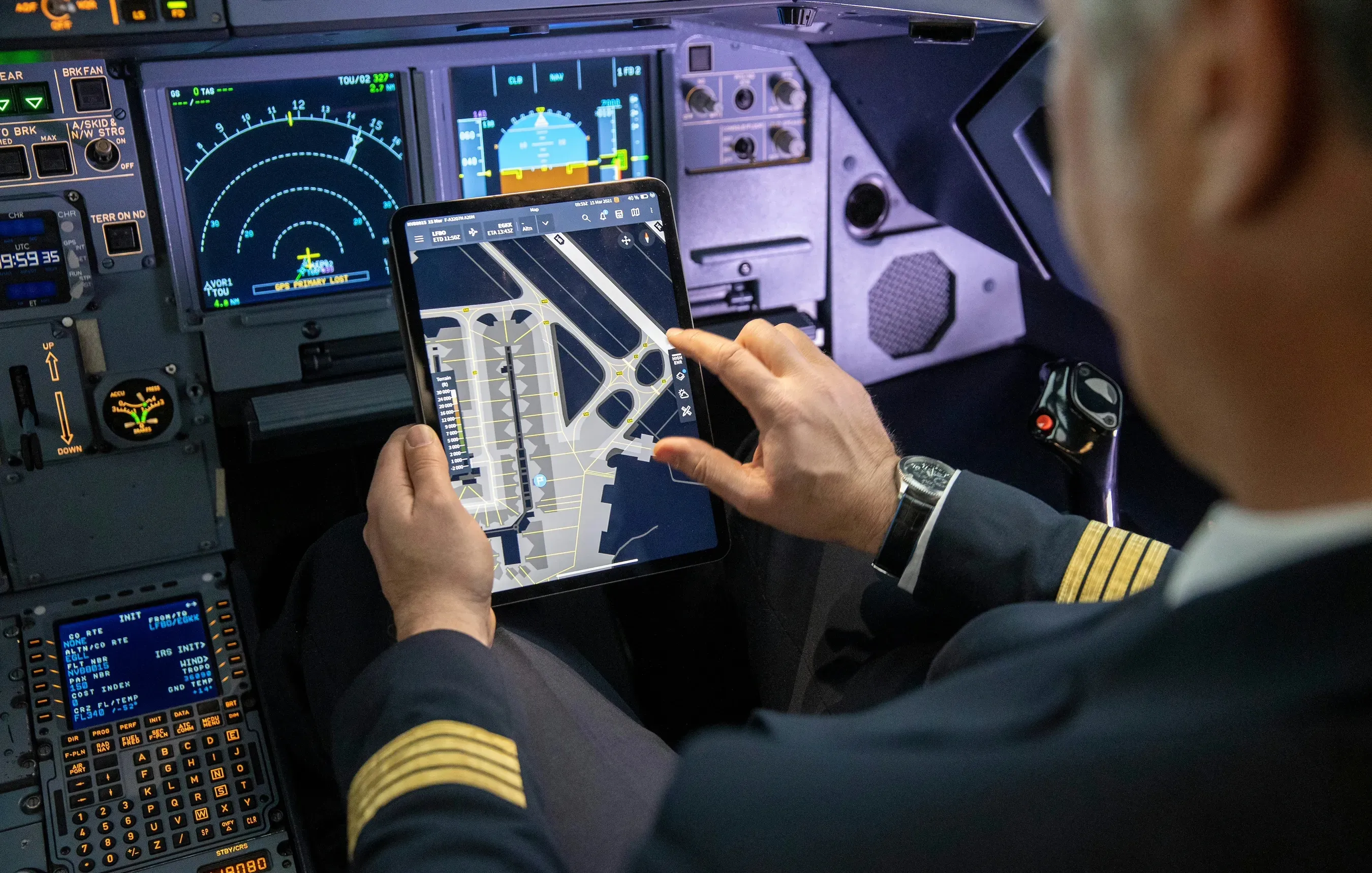
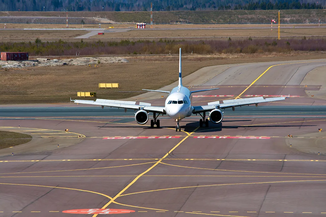
Taxiing is one of the riskiest phases on the ground. Runway incursions, where an aircraft enters a runway or taxiway it has not been cleared for, and disorientation in low visibility are among aviation’s most serious ground-safety concerns. A pilot receives a rapid taxi clearance over the radio, holds it in their head, and translates it onto a chart while the aircraft is already moving. I joined an Airbus Research and Technology team building a cockpit moving-map tool to make that safer and faster.
I was the only designer on the project. The role was framed internally as UI, because UX as a discipline was still unfamiliar in an engineering and human-factors culture. An early engineering proof of concept already existed, and I built the interface on top of it, with design decisions running through me, while still early in my career. Part of the work was making the case for research in a room that did not yet have the concept.
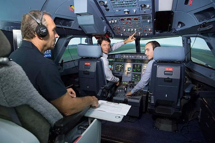
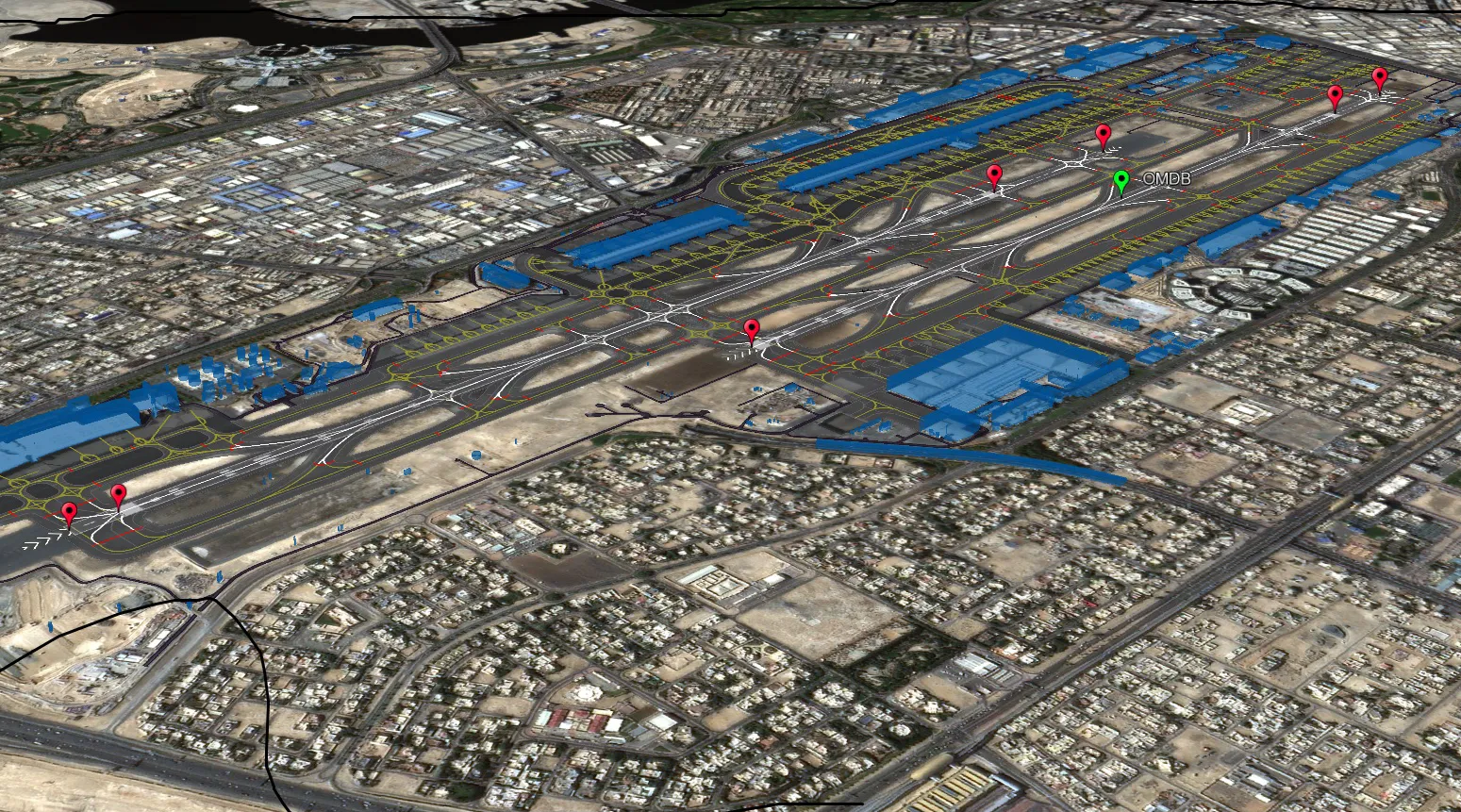
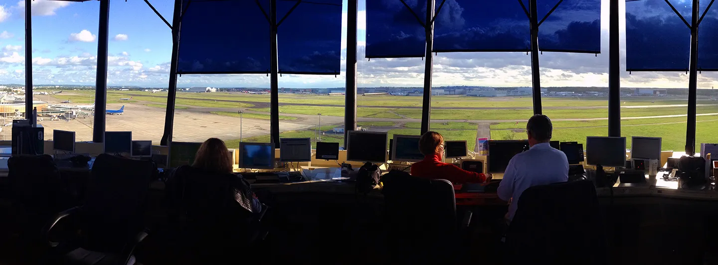
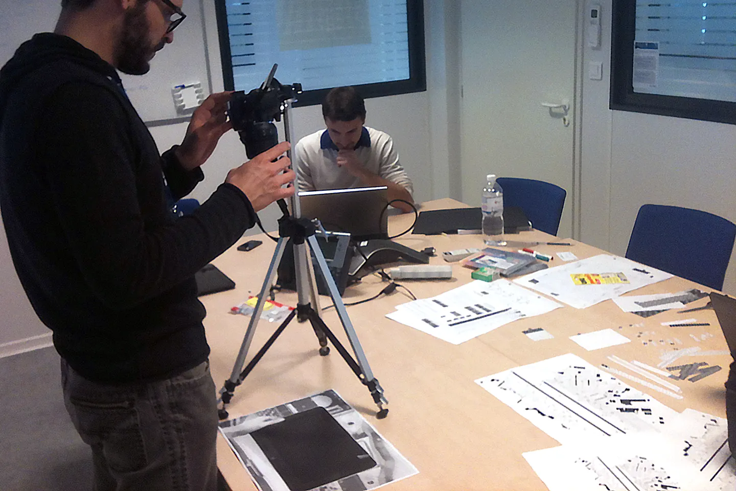
Shadowing controllers and observing pilots in simulator training, I noticed that everyone improvised. Pilots scribbled clearances onto whatever scrap of paper was within reach, or onto the chart itself, while listening. So I designed a scratchpad, a notepad-style popup they could write on directly with a finger. Alongside it, I designed the route input itself: tap a taxiway to select it, or drag across the map to draw the cleared path like a highlighter. Status colours followed the avionics convention pilots already trusted, separating what they had entered from what the system supplied.
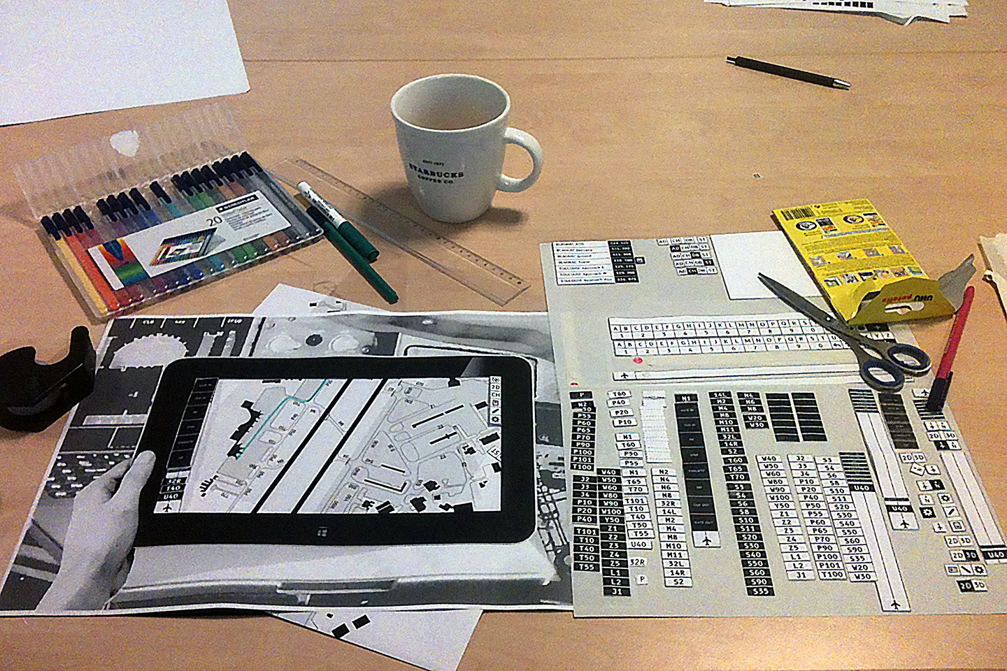
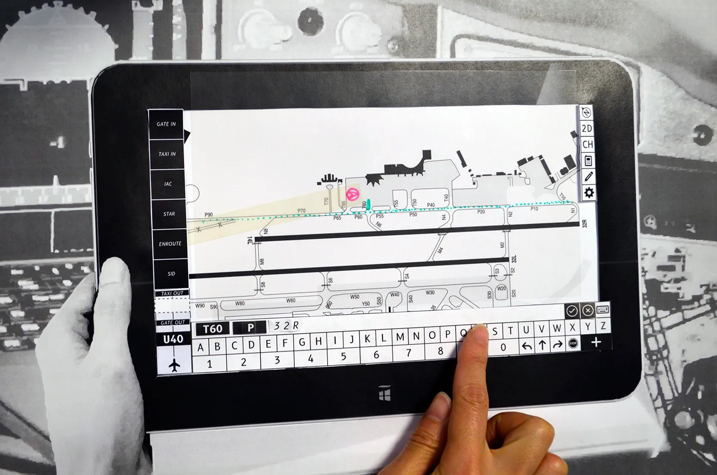
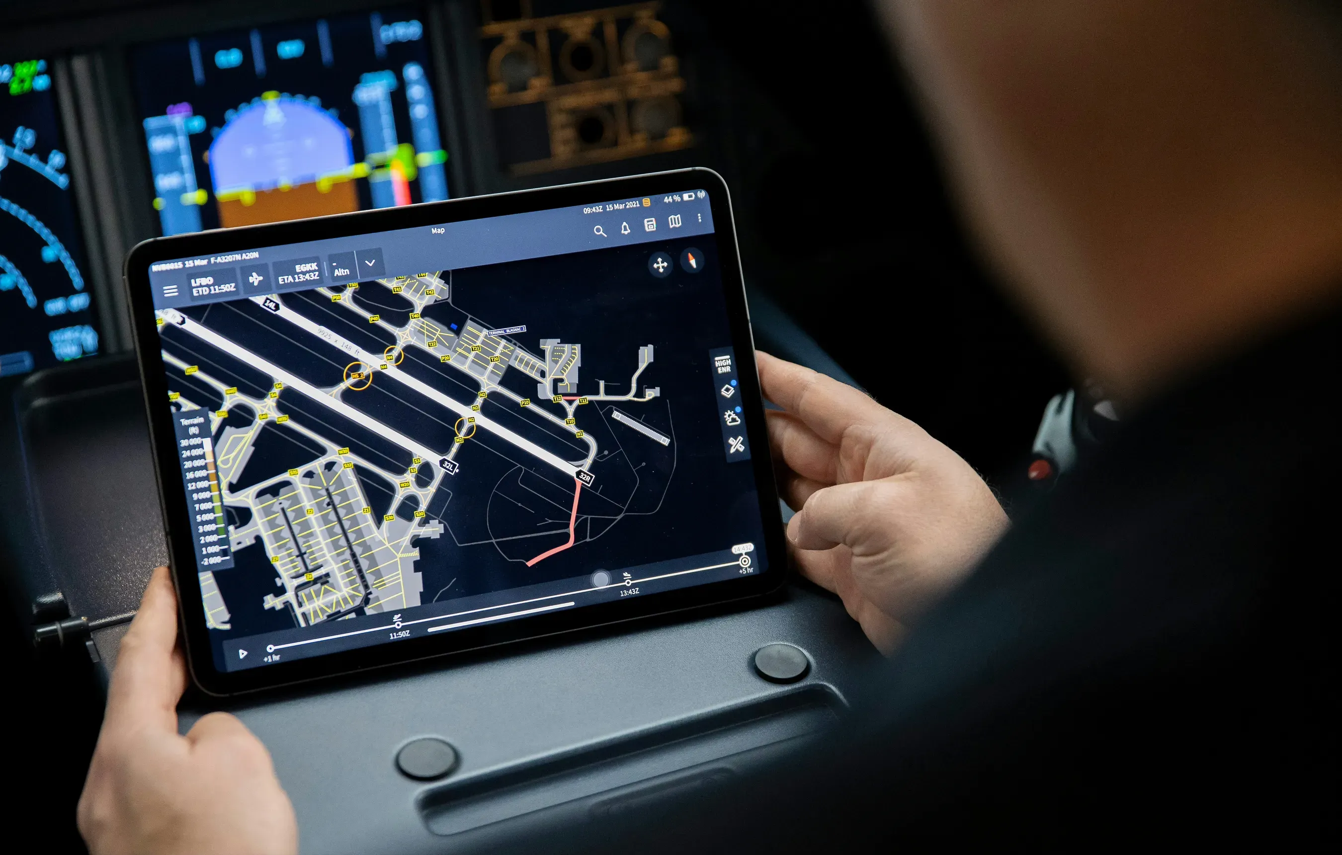
The concept was validated and evolved after I left, shipping to market as NAVBLUE Airport+. The touch-interaction sequences I designed are the ones illustrated in Airbus’s taxiing-path patent.
The lesson stuck: design from what people do, not what they say they need. The scratchpad came from watching a workaround nobody had thought to mention, and I have hunted for that signal ever since.